
Color in Weaving
Resident artisan Christine Novotny discusses her approach to color in her work in her latest blog post.
Coming from a painting background, I am always fascinated by color interaction. I am quick to emphasize color “interaction” rather than just color, because color does not really exist on its own. As colors sit next to each other, or in weaving, cross over and under each other in varying proportions, they mutate, lending more warmth, more dark values, more light values. One of my favorite quotes about color comes from Josef Albers, an artist and educator who wrote extensively about color and informed every color theory class I took in college:
“Color, in my opinion, behaves like man in two distinct ways: first in self-realization and then in realization of relationships with others.”

Color wrapping to plan a warp
Color can be an overwhelming piece to plan in a weaving. Many parts must be considered simultaneously - the proportional colors of the warp, which often sits in the background of a piece. Then the pattern itself and how it dictates how much warp and weft you see at once. And finally, the color/s of weft, which will often continue horizontally across a piece and shift in color as it interacts differently with a multicolored weft.
With all these things to consider, I like to do a lot of planning, and then a lot of sampling and experimenting with weft on the loom. When I keep an open mind toward my plans changing, I create pieces that never even entered my mind’s eye.
Here’s some of the things I do when I’m planning color in a weaving:
Color plying:
When I’m blending colors, I like to see how they react together. I do this to compare value and tone, to see how/if they compete for attention, which can be used to my advantage depending on the feel I’m going for. Sometimes two cones of yarn will look great next to each other, but when I wrap them together I can see how they respond to each other. If they are too similar in value (how light/dark the color is), they will cancel each other out. Color twists are quick ways to get a sense of colors together, but then the trick is to proportion the colors correctly.
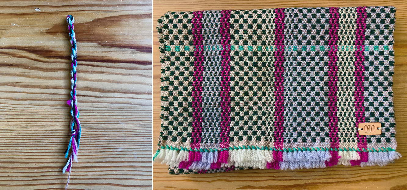
A color plying for a scarf, and the finished scarf
Color wraps:
I use this for planning warp. I can test out color proportions on these small cards just like I would on the weaving warp by assigning a number of wraps/inch of the finished weaving. On this small piece, I had 3 wraps per inch, which translates to an 18” wide warp.
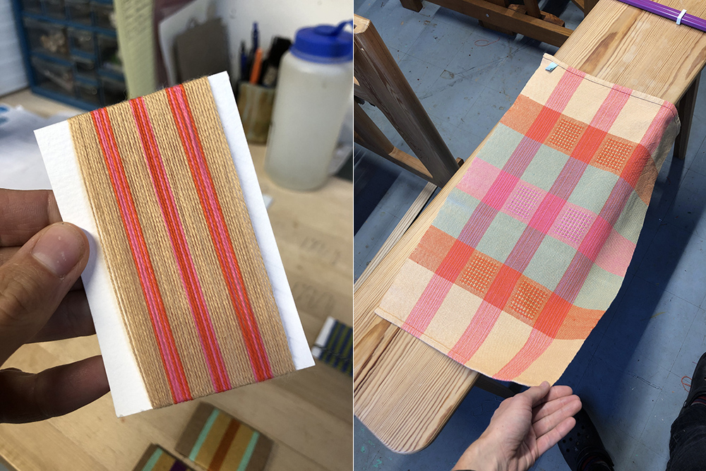
Color wrapping for a set of towels, and the finished towel. The color wrap is 3 wraps/inch of the finished piece.
All the while I am working with color theory as related to the color wheel. Here’s what I use most:
Complementary colors:
Complementary colors are two colors that when used next to each other will make the color pop. Complementary pairs are red/green, blue/orange, and yellow/purple. If you mix complementary colors together, those colors will cancel each other out and make a neutral brown. This is important to think about when working with plain weave, where the strands of yarn will optically combine in 1:1 ratios, effectively blending the two yarns to create a new color. Complementary colors can be used to advantage in a weave structure that utilizes blocks, creating larger swaths of color that sit independently from one another.
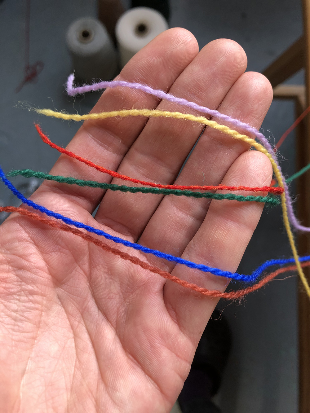
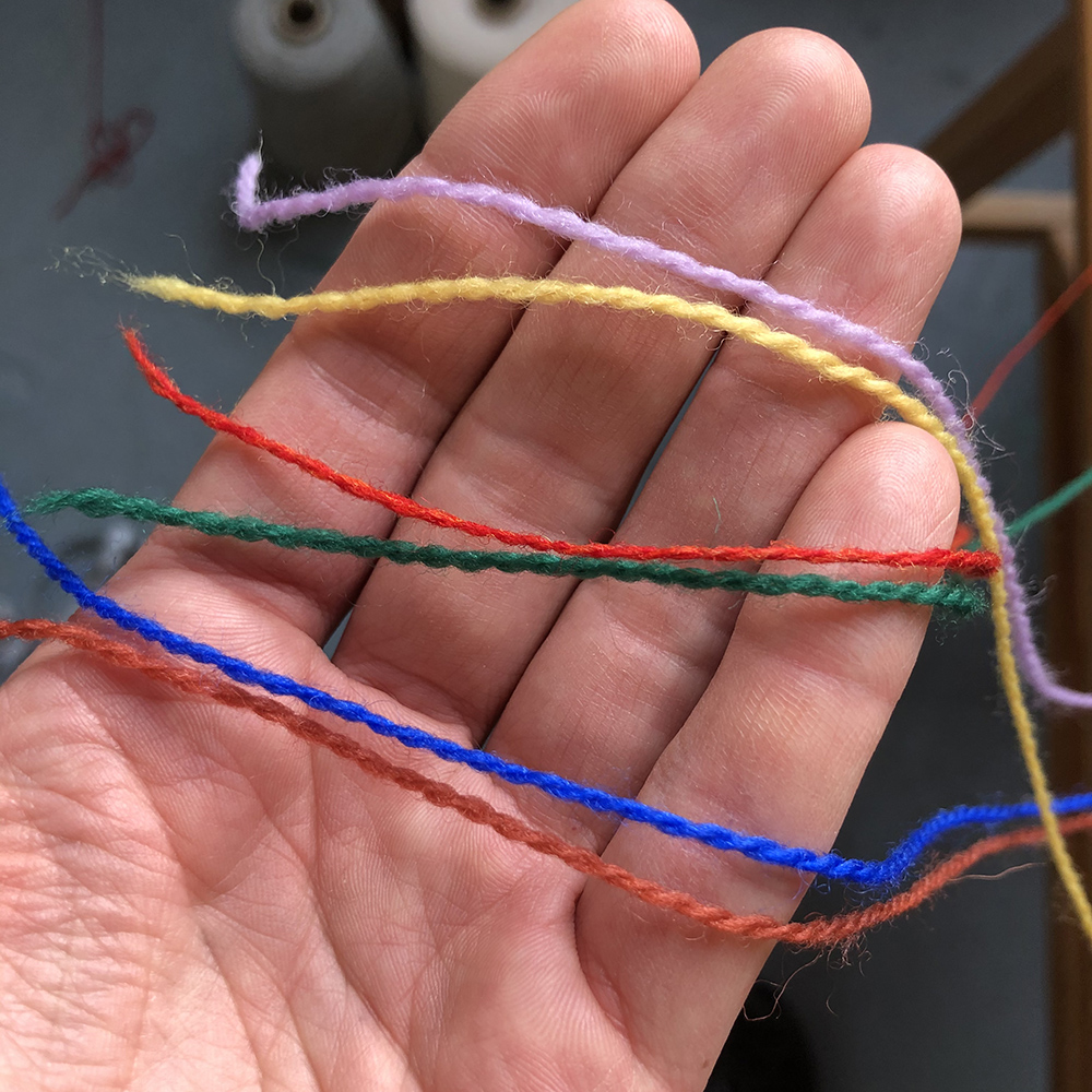
Wool threads of complementary colors
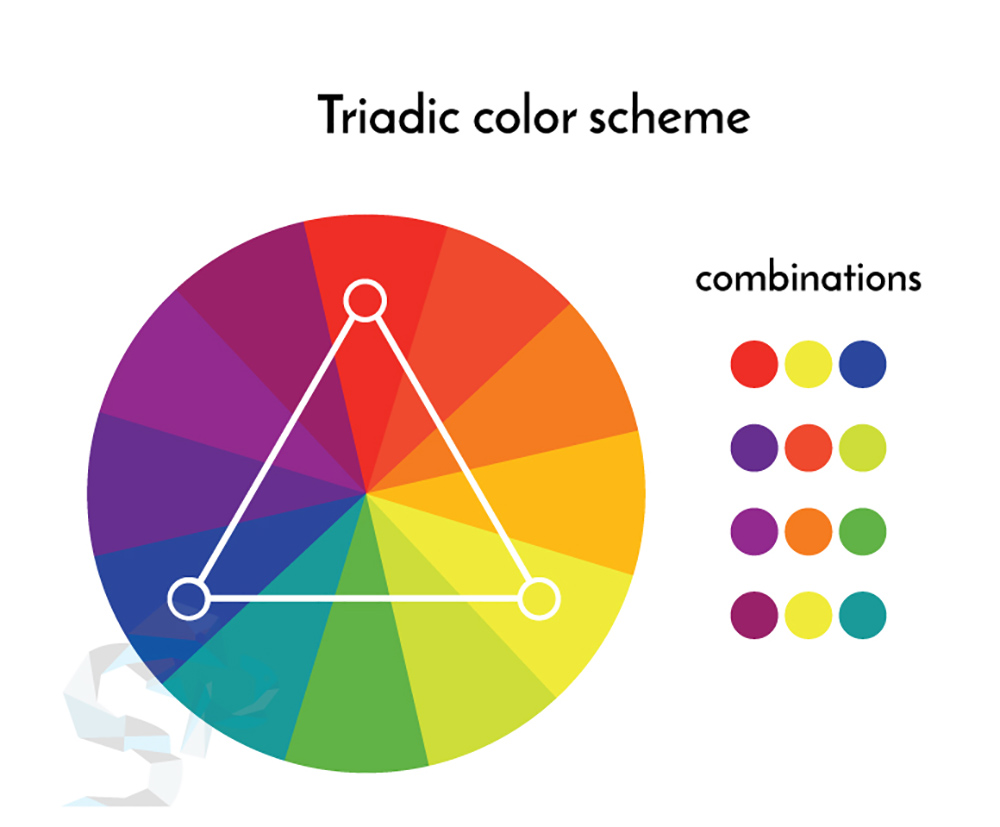
Color triads:
I love triads. A triadic color scheme uses colors that are equally separated around the color wheel. They tend to be vibrant color combinations when used at any level of saturation, and they always make colors really pop. I see triads coming through in all of my work, often in variants of the primary triad: red, blue, and yellow. Secondary triads are made up of the combination of our primary colors - orange, green, and purple. Tertiary colors are a combination of a secondary color and a primary color next to it. They include yellow-orange, red-orange, red-violet, blue-violet, blue-green and yellow-green.
These are just a few of the ways I look at color in my work. If you are a weaver and are interested in learning more about color, I encourage you to sign up for my Color Theory in Weaving class at North House Folk School this February! We will learn and practice all these concepts, dig into traditional color theory, and create 4 napkins in 4 weave structures that utilize color in different ways. This will be a great opportunity to boost your confidence in weaving and create textiles that express your color story.